15 트랜지션과 애니메이션
📁 시작파일
🥇완료파일
정보
📖 animation
01. transition
정보
02. transform
https://drive.google.com/file/d/1XLbC1IKHRrMrjq762KRaz0cv1Zmyw8Zv/view?usp=sharing정보
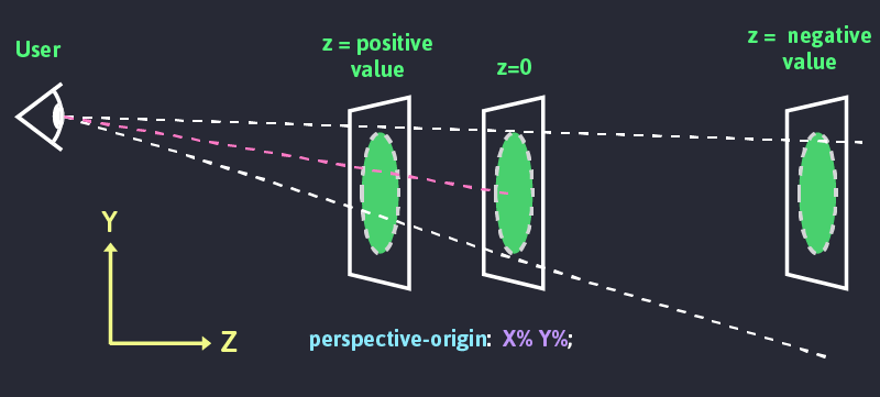
👁️🗨️ 3D공간으로 요소를 배치하려면 3가지 속성을 적용해야한다
- Perspective
- Perspective origin
- Transform Z
◾ Perspective : 요소의 z축과 사용자의 거리를 길이로 표시
- **Perspective **값이 크면 멀어서 작게, 작으면 가까워서 크게보임. (값은 0보다 커야함)
- 사람의 시지각은 멀리 떨어진 사물은 작게, 가까이 있는 사물은 크게 보인다.
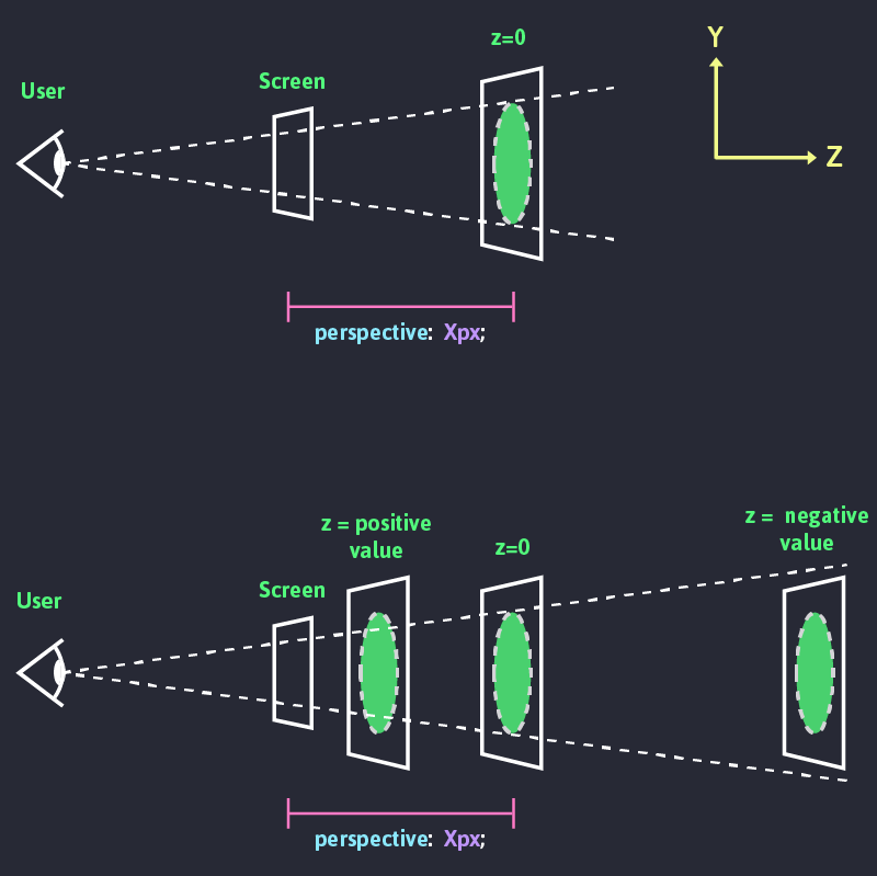
◾ Perspective-origin: 시선의 위치
- 사용자의 시선 위치를 조정하여 소실점적용
HTML
1<!DOCTYPE html>2<html lang="ko">3 <head>4 <meta charset="UTF-8" />5 <title>3dtransform</title>6 <link rel="stylesheet" href="css/style-0504.css">7 </head>8 <body>9 <div>10 <img src="https://placedog.net/300/300/" />11 <span> 트랜스폼 알아보기 </span>12 </div>13 </body>14</html>CSS
1div{width:50%;margin:200px auto}2div img{3  transition:all 0.35s;4}5
6div:hover img{7
8}HTML
1<!DOCTYPE html>2<html lang="ko">3 <head>4 <meta charset="UTF-8" />5 <title>3dtransform</title>6 <link rel="stylesheet" href="css/style-0505.css">7 </head>8 <body>9 <div id="container">10 <div class="origin">11 <div id="rotatex"></div>12 </div>13 <div class="origin">14 <div id="rotatey"></div>15 </div>16 <div class="origin">17 <div id="rotatez"></div>18 </div>19 <div class="origin">20 <div id="rotatexyz"></div>21 </div>22 </div>23 </body>24</html>CSS
1#container{2  width:800px;3  margin:20px auto;4}5.origin {6  width: 100px;7  height: 100px;8  margin: 40px;9  float: left;10  border: 1px solid black;11
12}13.origin > div {14 width:100px;15 height:100px;16 background-color:orange;17 transition:all 3s; /* 3초 동안 회전하도록 트랜지션 적용 */18}HTML
1<!DOCTYPE html>2<html lang="ko">3  <head>4    <meta charset="UTF-8" />5    <meta name="viewport" content="width=device-width, initial-scale=1" />6    <title>연습문제 2</title>7    <style>8      #container {9        width: 200px;10        margin: 30px auto;11      }12      img {13        border: 1px solid #ccc;14        border-radius: 50%;15        box-shadow: 5px 5px 30px 2px #000;16      }17    </style>18  </head>19
20  <body>21    <div id="container">22      <img src="https://placedog.net/200/200" alt="사진" />23    </div>24  </body>25</html>
CSS
1#container{2  width:800px;3  margin:20px auto;4}5.origin {6  width: 100px;7  height: 100px;8  margin: 40px;9  float: left;10  border: 1px solid black;11
12}13.origin > div {14 width:100px;15 height:100px;16 background-color:orange;17 transition:all 3s; /* 3초 동안 회전하도록 트랜지션 적용 */18}🟦 01-animation
1animation-name: box; /* 애니메이션 이름 */2 animation-duration: 2s; /* 애니메이션 지속시간 */3 animation-timing-function: ease-in-out; /* 가속도 */4 animation-delay:1s; /* 지연시간 */5 animation-iteration-count:infinite; /* 반복횟수 infinite 무한반복 */6 animation-play-state:paused;/* 재생상태 */7 animation-play-state:running;8 animation-direction:reverse;/* 재생방향 */9 animation-direction:alternate;/* 재생방향 */10 animation-fill-mode:forwards;/* backwards,both 정지상태 */🔶 01-01-keyframs
🔶HTML
1<!DOCTYPE html>2<html lang="en">3<head>4 <meta charset="UTF-8">5 <meta name="viewport" content="width=device-width, initial-scale=1.0">6 <title>키프레임</title>7 <link rel="stylesheet" href="./keyframes.css">8</head>9<body>10<div class="wrap">11 <h3 class="counter"></h3>12 <div class="box"></div>13</div>14</body>15</html>🔶CSS
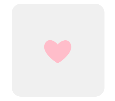
1.wrap{2    width: 300px;3    height: 300px;4    background-color: #f0f0f0;5    border-radius: 30px;6    margin: 0 auto;7    position: relative;8}9.box::before{10    content: '❤';11    position: absolute;12    left:100px;13    top: 100px;14    float: left;15    color: pink;16    font-size: 100px;17    line-height: 1;18    animation: heartbeat 1s 3 ease; /*심장 아이콘 애니메이션 반복 횟수(iterate)는 3회 */19}20.counter{/* 자바스크립트 이벤트 처리 메시지 출력 */21    text-align: center;22    color: pink;23}24/* 크기가 변하는 심장 아이콘 키프레임 애니메이션 */25@keyframes heartbeat {26    0% {27        transform: scale(1.0);28    }29    50% {30        transform: scale(1.3);31    }32    100% {33        transform: scale(1.0);34    }35}36
37@keyframes heartbeat2 {38    from {39        transform: scale(1.0);40    }41    to {42        transform: scale(1.3) translate(10px, 10px);43    }44}
🔶 01-02 transition
🔶HTML
1<!DOCTYPE html>2<html lang="en">3<head>4    <meta charset="UTF-8">5    <meta name="viewport" content="width=device-width, initial-scale=1.0">6    <title>트랜스폼과 트랜지션</title>7    <link rel="stylesheet" href="transition.css">8</head>9<body>10    <div class="coloring">11
12        <div class="box">변형<br/>요소</div>13    </div>14</body>15</html>
🔶CSS
1div.coloring{2 background-image: linear-gradient(45deg, rgba(255,0,36,1) 0%, rgba(255,9,121,1) 35%, rgba(0,212,255,1) 100%);3 background-color: #f0f0f0;4 width: 300px;5 height: 300px;6 margin: 0 auto;7 transition: background-image 1s ease;8 position: relative;9}10div.coloring:hover{11 /* background-image: linear-gradient(45deg, rgba(0,0,255,1) 0%, rgba(0,9,121,255) 35%, rgba(255,212,0,1) 100%); */12}13div{14 background-color: #fff;15}16div.box{17 float: left;18 width: 100px;19 height: 100px;20 background-color: #fff;21 transform: translate(200px, 200px) rotate(360deg);22 transition: all 1s ease 1s;23}24div.box2{25 float: right;26 width: 100px;27 height: 100px;28 transition: all 0.5s ease;29 transform: scale(1.3) translate(-100px, 100px) rotate(180deg);30}31div.box3{32 float: left;33 width: 100px;34 height: 100px;35 border: 1px solid pink;36 box-shadow: 0 0 15px -5px rgba(0,0,0,0.4);37 transform: scale(1.3) translate(100px, 100px) rotate(120deg);38 transition: transform 2s ease;39}40div.box4{41 float: left;42 width: 100px;43 height: 100px;44 border: 1px solid pink;45 box-shadow: 0 0 15px -5px rgba(0,0,0,0.4);46 animation: a 1s infinite alternate ease; /* 키프레임 애니메이션 적용 */47}48@keyframes a{49 to{50 transform: scale(1.3) translate(100px, 100px) rotate(120deg);51 }52}🟦 02-fillmode
애니메이션이 시작되기 전이나 끝나고 난 후 어떤 값이 적용될지 지정합니다.
🔶HTML
1<!DOCTYPE html>2<html lang="en">3<head>4 <meta charset="UTF-8">5 <meta name="viewport" content="width=device-width, initial-scale=1.0">6 <title>채우기모드의 이해</title>7 <link rel="stylesheet" href="./fillmode.css">8</head>9<body>10<div class="wrap">11 <div class="box"></div>12</div>13</body>14</html>🔶CSS
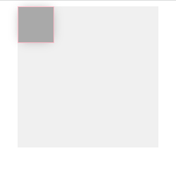
1.wrap{2 /*background-image: linear-gradient(45deg, rgba(255,0,36,1) 0%, rgba(255,9,121,1) 35%, rgba(0,212,255,1) 100%);*/3 background-color: #f0f0f0;4 width: 200px;5 height: 200px;6 margin: 0 auto;7 transition: background-image 1s ease;8 position: relative;9 background-color: #f0f0f0;10}11.box{12 float: left;13 width: 50px;14 height: 50px;15 border: 1px solid pink;16 box-shadow: 0 0 15px -5px rgba(0,0,0,0.4);17 background-color: darkgray;18 animation: rotate 1s steps(5, end) 1 none;19}20@keyframes rotate{21 from{22 background-color: pink;23 }24 to{25 background-color: lightblue;26 transform: scale(1.3) translate(100px, 100px) rotate(360deg);27 }28}필모드 문법
1/* Single animation */2animation-fill-mode: none;3animation-fill-mode: forwards;4animation-fill-mode: backwards;5animation-fill-mode: both;6
7/* Multiple animations */8animation-fill-mode: none, backwards;9animation-fill-mode: both, forwards, none;
🟦 02-animation-direction
애니메이션이 앞으로, 뒤로 또는 앞뒤로 번갈아 재생되어야하는지 여부를 지정합니다.
1/* Single animation */2animation-direction: normal;3animation-direction: reverse;4animation-direction: alternate;5animation-direction: alternate-reverse;6
7/* Multiple animations */8animation-direction: normal, reverse;9animation-direction: alternate, reverse, normal;10
11/* Global values */12animation-direction: inherit;13animation-direction: initial;14animation-direction: unset;15
16--------------------------------------------------------------------17normal18애니메이션은 매 사이클마다 정방향으로 재생됩니다. 즉, 순환 할 때마다 애니메이션이 시작 상태로 재설정되고 다시 시작됩니다. 이것은 기본값입니다.19
20reverse21애니메이션은 매 사이클마다 역방향으로 재생됩니다. 즉, 순환 할 때마다 애니메이션이 종료 상태로 재설정되고 다시 시작됩니다. 애니메이션 단계가 거꾸로 수행되고 타이밍 기능 또한 반대로됩니다. 예를 들어, ease-in 타이밍 기능은 ease-out형태로 변경됩니다.22
23alternate24애니메이션은 매 사이클마다 각 주기의 방향을 뒤집으며, 첫 번째 반복은 정방향으로 진행됩니다. 사이클이 짝수인지 홀수인지를 결정하는 카운트가 하나에서 시작됩니다.25
26alternate-reverse27애니메이션은 매 사이클마다 각 주기의 방향을 뒤집으며, 첫 번째 반복은 역방향으로 진행됩니다. 사이클이 짝수인지 홀수인지를 결정하는 카운트가 하나에서 시작됩니다.
🟦 03-multi-animations
🔶HTML
1<!DOCTYPE html>2<html lang="en">3<head>4 <meta charset="UTF-8">5 <meta name="viewport" content="width=device-width, initial-scale=1.0">6 <title>멀티 애니메이션</title>7 <link rel="stylesheet" href="./multianimations.css">8</head>9<body>10<div class="wrap">11 <div class="box"></div>12</div>13</body>14</html>🔶CSS
1.wrap{2 /*background-image: linear-gradient(45deg, rgba(255,0,36,1) 0%, rgba(255,9,121,1) 35%, rgba(0,212,255,1) 100%);*/3 background-color: #f0f0f0;4 width: 200px;5 height: 200px;6 margin: 0 auto;7 transition: background-image 1s ease;8 position: relative;9 background-color: #f0f0f0;10}11.box{12 float: left;13 width: 50px;14 height: 50px;15 border: 1px solid pink;16 box-shadow: 0 0 15px -5px rgba(0,0,0,0.4);17 background-color: darkgray;18 animation: rotate 2s linear, scale 1s ease;19}20@keyframes rotate{21 from{22 background-color: pink;23 }24 to{25 background-color: lightblue;26 transform: translate(100px, 100px) rotate(360deg);27 }28}29@keyframes scale{30 to{31 background-color: black;32 transform: scale(1.3);33 }34}🔶HTML2
1<!DOCTYPE html>2<html lang="en">3<head>4 <meta charset="UTF-8">5 <meta name="viewport" content="width=device-width, initial-scale=1.0">6 <title>멀티 애니메이션</title>7 <link rel="stylesheet" href="./multianimations-caution.css">8</head>9<body>10<div class="wrap">11 <div class="box"></div>12</div>13</body>14</html>🔶CSS2
1body{2 padding-top: 100px;3}4.wrap{5 /*background-image: linear-gradient(45deg, rgba(255,0,36,1) 0%, rgba(255,9,121,1) 35%, rgba(0,212,255,1) 100%);*/6 background-color: #f0f0f0;7 width: 200px;8 height: 200px;9 margin: 0 auto;10 transition: background-image 1s ease;11 position: relative;12 background-color: #f0f0f0;13}14.box{15 float: left;16 width: 50px;17 height: 50px;18 border: 1px solid pink;19 box-shadow: 0 0 15px -5px rgba(0,0,0,0.4);20 background-color: darkred;21 animation: rotate 2s linear backwards, scale 2s linear 1s forwards;22}23@keyframes rotate{24 to{25 background-color: lightblue;26 transform: translate(100px, 100px) rotate(360deg);27 }28}29@keyframes scale{30 to{31 background-color: black;32 transform: scale(1.5);33 }34}🟦 04-변수 애니메이션
🔶01
▪️HTML-1
1<!DOCTYPE html>2<html lang="en">3<head>4 <meta charset="UTF-8">5 <meta name="viewport" content="width=device-width, initial-scale=1.0">6 <title>변수를 이용해 애니메이션 만들기1</title>7 <link rel="stylesheet" href="./variable1.css">8</head>9<body>10<div class="wrap">11 <div class="box"></div>12 <div class="box"></div>13 <div class="box"></div>14 <div class="box"></div>15 <div class="box"></div>16</div>17</body>18</html>▪️CSS-1
1.wrap{2    width: 300px;3    height: 300px;4
5    border-radius: 30px;6    margin: 0 auto;7    position: relative;8}9
10.box{11    left:100px;12    top: 100px;13}14.box:nth-child(1){15    --size: 1.6;16}17.box:nth-child(2){18    --size: 1.5;19}20.box:nth-child(3){21    --size: 2;22}23.box:nth-child(4){24    --size: 2.8;25}26.box:nth-child(5){27    --size: 1.3;28}29.box::before{30    content: '❤';31    position: absolute;32    display: inline-block;33    left: 100px;34    top: 100px;35    color: pink;36    font-size: 75px;37    line-height: 1;38    animation: heartbeat 2s infinite ease;39}40
41@keyframes heartbeat {42    to {43        transform: scale(calc(var(--size)*2));44        opacity: 0;45    }46}
🟦 05-path-animation
🔶01
▪️html-1
1<!DOCTYPE html>2<html lang="en">3<head>4 <meta charset="UTF-8">5 <meta name="viewport" content="width=device-width, initial-scale=1.0">6 <title>경로 애니메이션1</title>7 <link rel="stylesheet" href="pathanimation1.css">8</head>9<body>10 <div class="coloring">11 <div class="box"></div>12 </div>13</body>14</html>▪️css-1
1div.coloring{2    /*background-image: linear-gradient(45deg, rgba(255,0,36,1) 0%, rgba(255,9,121,1) 35%, rgba(0,212,255,1) 100%);*/3    background-color: #f0f0f0;4    width: 300px;5    height: 300px;6    margin: 0 auto;7    transition: background-image 1s ease;8    position: relative;9}10div.coloring:hover{11    /* background-image: linear-gradient(45deg, rgba(0,0,255,1) 0%, rgba(0,9,121,255) 35%, rgba(255,212,0,1) 100%); */12}13div{14    background-color: #fff;15}16
17div.box{18    position: absolute;19    left: 70px;20    top: 70px;21    width: 60px;22    height: 60px;23    background-color: #a00;24    border: 5px solid pink;25    box-shadow: 0 0 15px -5px rgba(0,0,0,0.4);26    border-radius: 35px;27    animation: moveto 1s infinite alternate ease;28}29@keyframes moveto{30    25% {31        transform: translate(100px, 0px);32    }33    50%{34        transform: translate(100px, 100px);35    }36    75%{37        transform: translate(0px, 100px);38    }39    100%{40        transform: translate(0px, 0px);41    }42}
🔶02
▪️html-2
1<!DOCTYPE html>2<html lang="en">3<head>4 <meta charset="UTF-8">5 <meta name="viewport" content="width=device-width, initial-scale=1.0">6 <title>경로 애니메이션2</title>7 <link rel="stylesheet" href="pathanimation2.css">8</head>9<body>10 <div class="wrap">11 <div class="box"></div>12 </div>13</body>14</html>▪️css-2
1.wrap{2    background-color: #f0f0f0;3    width: 600px;4    height: 200px;5}6
7.box{8    position: absolute;9    left: 70px;10    top: 70px;11    width: 60px;12    height: 60px;13    background-color: #a00;14    border: 5px solid pink;15    box-shadow: 0 0 15px -5px rgba(0,0,0,0.4);16    border-radius: 35px;17    offset: path('M0,100c10,-50 82.095,-82.507 127.089,0c19.734,-79.314 119.195,-102.241 151.559,0c5.526,-77.735 101.322,-104.262 149.192,-52.888') auto;18    animation: moveto 5s ease;19}20@keyframes moveto{21    0%{22        offset-distance: 0%23    }24    100%{25        offset-distance: 100%;26    }27}
🔶03
▪️html-3
1<!DOCTYPE html>2<html lang="en">3<head>4 <meta charset="UTF-8">5 <meta name="viewport" content="width=device-width, initial-scale=1.0">6 <title>경로 애니메이션3</title>7 <link rel="stylesheet" href="pathanimation3.css">8</head>9<body>10 <div class="wrap">11 <div class="box"></div>12 </div>13</body>14</html>▪️css-3
1.wrap{2    background-color: #f0f0f0;3    width: 600px;4    height: 200px;5}6
7.box{8    position: absolute;9    left: 70px;10    top: 70px;11    width: 60px;12    height: 60px;13    background-color: transparent;14    offset: path('M0,100c10,-50 82.095,-82.507 127.089,0c19.734,-79.314 119.195,-102.241 151.559,0c5.526,-77.735 101.322,-104.262 149.192,-52.888') auto;15    animation: moveto 5s ease;16}17.box::after{18    content:url(./img/twitter_logo_original.svg);19    display: block;20}21@keyframes moveto{22    0%{23        offset-distance: 0%24    }25    100%{26        offset-distance: 100%;27    }28}

🟦 06 썸네일호버1
🔶html
1<!DOCTYPE html>2<html lang="ko">3 <head>4 <meta charset="UTF-8" />5 <meta name="viewport" content="width=device-width, initial-scale=1" />6 <title>CSS3 애니메이션</title>7 <style>8 #container {9 width: 1000px;10 margin: 20px auto;11 }12 h1 {13 text-align: center;14 }15 .prod-list {16 list-style: none;17 padding: 0;18 }19 .prod-list li {20 float: left;21 padding: 0;22 margin: 10px;23 overflow: hidden;24 }25 .prod-list img {26 margin: 0;27 padding: 0;28 float: left;29 z-index: 5;30 }31 </style>32 </head>33 <body>34 <div id="container">35 <h1>신상품 목록</h1>36 <ul class="prod-list">37 <li>38 <img src="https://placedog.net/300/200?random" />39 <div class="caption">40 <h2>상품 1</h2>41 <p>상품 1 설명 텍스트</p>42 <p>가격 : 12,345원</p>43 </div>44 </li>45 <li>46 <img src="https://placedog.net/300/200?random" />47 <div class="caption">48 <h2>상품 2</h2>49 <p>상품 2 설명 텍스트</p>50 <p>가격 : 12,345원</p>51 </div>52 </li>53 <li>54 <img src="https://placedog.net/300/200?random" />55 <div class="caption">56 <h2>상품 3</h2>57 <p>상품 3 설명 텍스트</p>58 <p>가격 : 12,345원</p>59 </div>60 </li>61 </ul>62 </div>63 </body>64</html>▪️css-1
1div.coloring{2    /*background-image: linear-gradient(45deg, rgba(255,0,36,1) 0%, rgba(255,9,121,1) 35%, rgba(0,212,255,1) 100%);*/3    background-color: #f0f0f0;4    width: 300px;5    height: 300px;6    margin: 0 auto;7    transition: background-image 1s ease;8    position: relative;9}10div.coloring:hover{11    /* background-image: linear-gradient(45deg, rgba(0,0,255,1) 0%, rgba(0,9,121,255) 35%, rgba(255,212,0,1) 100%); */12}13div{14    background-color: #fff;15}16
17div.box{18    position: absolute;19    left: 70px;20    top: 70px;21    width: 60px;22    height: 60px;23    background-color: #a00;24    border: 5px solid pink;25    box-shadow: 0 0 15px -5px rgba(0,0,0,0.4);26    border-radius: 35px;27    animation: moveto 1s infinite alternate ease;28}29@keyframes moveto{30    25% {31        transform: translate(100px, 0px);32    }33    50%{34        transform: translate(100px, 100px);35    }36    75%{37        transform: translate(0px, 100px);38    }39    100%{40        transform: translate(0px, 0px);41    }42}